
Unholy Confusion

I just got a review copy of Stacia Kane’s Unholy Ghosts and started to check it out, and then said, Huh? Haven’t I already read this? Turns out I had. A couple of months ago, I read an advance reader’s copy (ARC). I liked the story. I’m interested in reading a sequel. It’s a paranormal, of course. Tough gal, tough world, tough personal situation, and a couple of tough men in her life who are rather appealing to an unreformed romantic like me.
Unholy Ghosts came out in mass market (rack size) paperback in the last few weeks, with a typical paranormal cover. As you can see, the heroine is not wearing much up top, so her tattoos are visible. There’s enough darkness on the cover to suggest the futuristic dystopia in which many paranormals take place, but enough color to show that same futuristic city. and rope in any science fiction or fantasy fans.

Meanwhile, over in England, there’s a different cover, but with much of the same color choices and setup. No tattoos visible, but she’s wearing a serious kind of jacket, and there’s a sword, too. (Nice look.) The standard lonely-female-in-the-dark-place vibe is happening with this cover, just as with the U.S. cover.

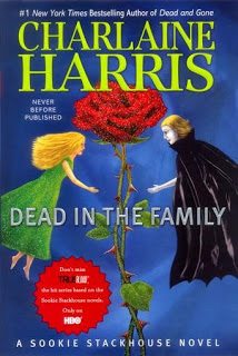
The surprise is this British trade paperback (snooty, more upscale version) that is also out now and costs three pounds more, which looks just like the British erotica-tinged covers for Charlaine Harris’ vampire series (an example of which you can see by checking out my earlier post entitled An Embarrassment of Men). It’s the same mood and the same color scheme. Totally unlike the cartoonish U.S. hardcover book covers.
Is your head spinning yet? Mine is.
Most people in publishing believe that book buyers are stratified, and on the whole I agree. Some only buy hardcover books. There are others, like myself, who never buy hardcover books. I don’t care if it’s by my favorite author, I’ll read it in hardcover from the public library (I know, anathema to many writers, but the library is the writer’s best friend). If I absolutely adore a book I have read in hardcover, I might buy a copy in paper when it is released, but only if I like the cover—a lot.
That’s my taste. But what about the rest of the book buying world? In this example, the mass market covers are more colorful than the trade covers. But the hardcover cover is more colorful still. What does this say about book buyers? Honestly, I don’t know. If we have $25 to spend on a book, we’d like some quirky art and color on the cover? If we only want to spend $12, we’d prefer something monotone with a splash of sexy red? And if we pony up a mere $8, then please give us plenty of color and accurate representational art?
Of course, I could avoid being confused if I just “rented” a copy of this book via some digital download (you know, buying it and only owning it until my reading device or my computer crashes for good). Then the colors, the art, the size of the typeface, even the font wouldn’t really matter, would they? Just the words.