
Clever (and Not So Clever) Romance Marketing

Romance authors used to just write books. Now, they often self-publish them, or even if they get a contract with a major publisher, they self-promote them. Which leads to some mistakes and some hits.
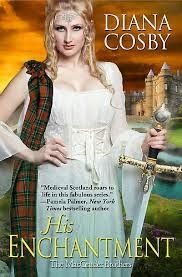
I picked up some vivid examples of promotional materials at the New Jersey Romance Writers annual conference to share with you. This year, I’d say the smartest move I saw was the big change Diana Cosby made with her latest book cover. It might have been her publisher’s idea, or it might have been hers, but after a series of action hunk covers showing naked chests of Scottish warriors (and one notable cover with a dark-haired, sword-wielding, female warrior, chest modestly covered) the latest is, as you can see, a passive-looking pose. But…have you already noticed the resemblance to the blonde, Cersei, in Game of Thrones? Diana Cosby’s romances have no official tie-in with the runaway television hit series, or with George R. R. Martin’s series of novels. But her latest cover deliberately riffs on the extreme blondness of his television character. The implicit message in a cover like this is: “If you like Game of Thrones, you’ll like this book.” Maybe it’s true; maybe it isn’t. But the visual tie-in makes you stop and look. Score.

Sometimes we have a book whose publicity piece is way off the mark. In the spirit of “any publicity is good publicity,” I’m pillorying a bookmark here for you to agree or disagree. What’s wrong with the cover of Finding Isadora? Nothing. It’s romantic. It’s charming. It shouts “Women’s fiction about an older heroine finally finding her true self with a new man.” Many women’s fiction relationship books have beach scenes on the cover, like this one. They usually don’t show people’s faces, and this one doesn’t. And they have an aspect of whimsy to them. The woman holding her dress out to be more balletic in the ocean wind is a perfect example of whimsy. She’s happy. Sounds great, right? But look at the cover copy: “He’s the worst man in the world for her.” Oh, really? Doesn’t look that way. If he’s dangerous to a life of dancing on the beach, this cover composition does not say so. It says the opposite. Maybe the cover copy is wrong, then? But the back of the bookmark delves into more details about why the heroine’s heartthrob hero is the dangerous type—he’s an activist lawyer, by golly. Danger. Danger. This is an attractive cover. I like this cover. If this book were about what this cover art says it is, I’d read this book. But is it?
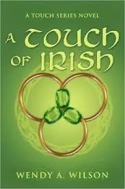
My third cover is A Touch of the Irish by Wendy A. Wilson. I picked it up because it’s such a nice green and the cover design is pretty. But I have no clue what the story is about. That’s kind of a problem, since the business card it’s printed on yields no descriptive copy. Is this a romance? Is it about leprechauns? Is it about three emerald rings? I’ve got a lot of Irish blood, but like most Americans, I’ve been acculturated out of my native heritage, so I have zero clue as to whether the three rings mean anything in Irish lore, past or present. But I do like the color green. The top of the book says it’s a Touch Series Novel, but I don’t know what that is. Cover copy that tells what this book is about would have sold it. Lost opportunity. But wait, you say. Isn’t there a well-established cover style that major romance authors have used that does not show a man embracing a woman? That instead shows flowers, or the like? Yes, that’s true, but those romances are by best-selling authors who basically need no introduction to the reader. And they rate cover blurbs from other famous authors. They do tell something.
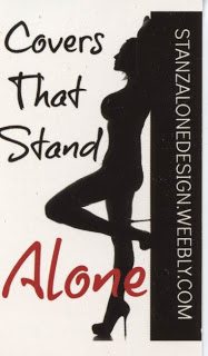
Are you interested in a fourth marketing piece? Okay, here’s a business card advertising a cover design company, something many self-published authors may want to check out. The silhouetted woman, black on white, is very striking. That catches my eye, which is good. Then I notice the unrealistically enormous bosom on the woman and her open, passive pose. She also looks like she has very big hair or is wearing a Las Vegas showgirl headdress. And anyway, for a romance, who cares if the woman looks sexy? We’re not selling hot-looking women to romance readers. We’re selling women doing something, or hot-looking men, or men and women embracing. To me this marketing piece suggests the company does not understand who reads romance and what a romance heroine should look like. Even urban fantasy heroines with their tank tops and big weapons are posed actively and do not sport massive gazongas like these. I’m not sure I’d want my girl-next-door, self-published romance (if I had written one) to have its cover designed by this crew. It’s a striking business piece, but the silhouette is too objectifying for the kinds of books I write, and that’s a problem because it disinvites me. Perhaps it invites writers of erotica? Not unless the woman is holding a whip.
So there we have it. The most striking promo pieces from this year’s haul. All of them successfully drew me in. Some of them left me wondering.