
It’s Not Easy Being Green
Green is the theme this time around, as I bring you images from the New Jersey Romance Writers Put Your Heart in a Book conference. I like to pick up promotional materials at the conference and analyze them. You get to look at the pretty pictures.
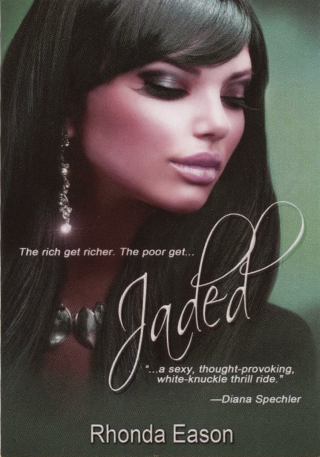
Of three promotional postcards, our first is Jaded, by Rhonda Eason. This is a very cool-looking cover, with a green background and a green tinge to the cover model’s hair, and the mere hint of green in her smoky-eyes shadow. I like the touches of green in the model’s dress and necklace. They’re subtle enough to be interesting, and matchy-matchy enough to appeal to those of us who grew up playing with dolls. (That would be most women.) You know our dolls’ shoes and bag matched their dresses—but that’s a discussion for another day. When we think of jade, we think of a far less saturated color, but part of this cover’s clever design is that the green, while striking, isn’t what rules the cover. The cover’s model’s face is the standout of the design. Everything else trends toward or is so dark that we only imagine the cover is very green. It’s a striking cover. I do have a couple of concerns. At thumbnail size, the lacy title font breaks up and is illegible. And this portrait cover gives no hint of the book’s complicated suspense plot that involves an employer named Jade, and sex, and money.

My second pick is The Emerald Key, by Vicky Burkholder. I’m a sucker for any mention of emerald, one of my favorite jewels and colors. This cover has a lot of green, so much that the title word “Emerald” gets a little lost. That’s a design issue that could be solved by doing the word in a slightly different color. If this book has a print edition, embossing “Emerald” and printing that word in foil would make a nice contrasting effect, although an expensive one. Because I’m looking at a promotional postcard, I can flip it to read the descriptive copy—and discover that this clinch cover, a classic in romances, is promoting a paranormal tale. Totally not what the cover tells me. Our gal who is being helped out of her clothing has magic powers and has a romance with a man who also has magic powers, and they’re on the run from a murderous stalker. Whew. That’s a load of suspense and danger, none of which is suggested by the cover. I assume the reason is that this story has tons of romantic moments and not many scary scenes. I hope.
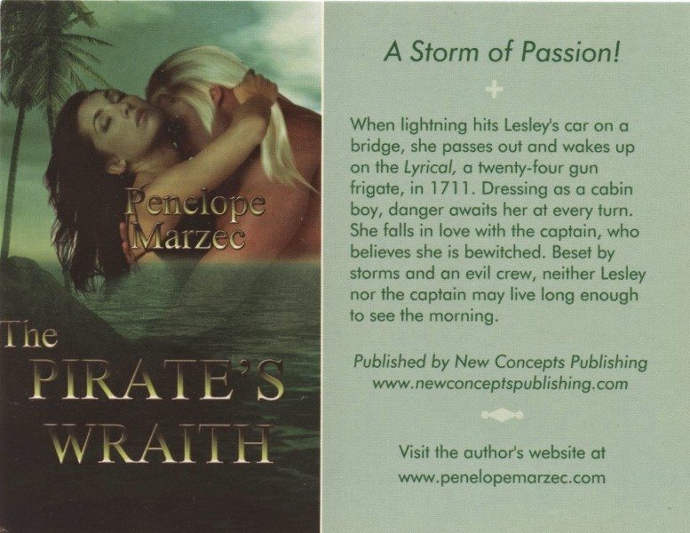
The Pirate’s Wraith, by Penelope Marzec, is a time-travel historical romance taking place in the 18th century—on a pirate ship, of course. Here’s another clinch cover, backed up by a palm tree and an ocean, but very much submerged by too much green. Because this is an ebook, how it looks in a thumbnail size is important, and alas, at that small size, the cover gets very dark and the title is unreadable. This cover attracted me because it was so green, but I can barely discern its details. However, a little touch-up to the saturation of the green, and changing the fonts to make the title and the author’s name contrast strongly with the background, and this cover will make the statement it intends.
I’ll bet you think these are all self-published books whose authors designed their own covers. Wrong. All three are published by small presses. The covers were done by professional designers, as far as I know. Each cover has appeal, despite what I see as some design errors. That’s why I picked them.