
Misleading Book Covers
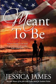
Every year I attend a romance writers’ conference and bring back interesting book covers for you to enjoy and puzzle over. This year’s prize piece is Meant To Be, a contemporary romantic suspense by established historical author Jessica James. The first and most noticeable image of the cover is our nation’s flag. The red, white, and blue draw the eye. The next most important image on the cover is of two lovers walking hand-in-hand on a beach at sunset. Can’t get more romantic than that, right? The third significant element of the cover is so obscured by its dark color and by deliberate fading to highlight the beach that I didn’t realize (until today) it’s a man firing a gun! How could I not see that gun previously? The red, white, and blue, and the orange sunset draw attention to the top of the cover. The romantic couple and the sentimental title, Meant To Be, both signal this will be a romance. The gun can easily be mistaken for a piece of driftwood or a furled beach umbrella piled on something. Whoops. Someone expecting a peaceful story about a chance meeting in Ocean City, Maryland, will be very disappointed when the tale moves to war-torn Afghanistan and life-and-death situations. But I ask you, how much studying of a cover does anyone do?

Next up is Bedeviled Angel, by Annette Miller. This cover is very simple. It has no background. All we see is a man with an eye patch putting moves on a bored heroine. That’s what the cover shows. The model’s expression clearly says “Get me out of here!” But the novel’s description says something very different. The heroine is a paranormal law enforcement agent and the hero is being hunted.

The series, Angel Haven Romances, is about heroes who get rescued by heroines. I’m all for that. Too bad the cover says exactly the opposite of what the book is about. It’s worth pointing out that a publisher, one that has produced many books, created this cover. I don’t think it does the story’s basic scenario justice, and if I’m the kind of reader looking for a strong heroine, this cover will not encourage me to find her here. A shame. (Also, another author with the same first name has a book with the same title. A little awkward?)
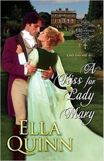
Our third piece of misdirection is A Kiss for Lady Mary, by bestselling author Ella Quinn. This classic Regency romance cover has the soft look of an old-style Regency, and it’s a nicely painted scene with a couple about to kiss, a view of a stately home, and so on. It’s appealing because it’s so pretty. Where this kind of cover fails is that is says nothing about this particular story or these specific characters. This could be any Regency romance. What is to make a reader want to read this one? The plot description describes a young woman actually being stalked by an unwanted suitor, and a hero who is too shy to make moves on the lady he loves. Both of these situations could be difficult to convey on a cover, but either could have been hinted at and resulted in a dynamic, dramatic cover. What we have instead is a generic cover, and that’s fine for the author’s established fan base, but what’s to attract someone new to read it? The cover implies sweet Regency romance, and perhaps that’s good enough. But what if it isn’t?
Even with their misdirection, blandness, and their baffling flaws, these covers are attractive and serve their basic function of getting attention. Still, a romance reader would be well advised to read each story description carefully. The covers don’t tell the whole story.